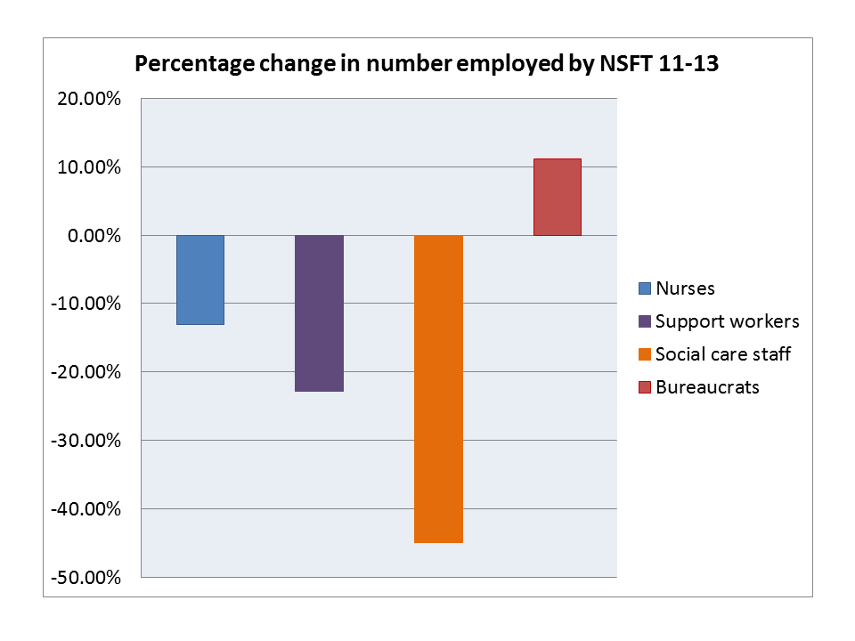
Sometimes a graph just says it all. Sources are the Norfolk & Suffolk NHS Foundation Trust Annual Report & Accounts 2012 and 2013. Figures are the percentage changes in mean number of whole time equivalent (WTE) staff employed in the listed categories during the financial years ending 2011 and 2013.
1 thought on “Graphic: Change in numbers of nurses, support workers, social care staff and bureaucrats at NSFT 2011-13”
Jumper
I’m not trying to undermine this statement or article but without some explanation this graph doesn’t add up. A couple points that I’d like to note are:
1. NSFT wasn’t formed until January 2012, therefore how is it possible to reference the 2011 annual report.
2. I’t would be great to see a link to the actual reports where this information came from from as I’m sure the definition ‘bureaucrat’ isn’t used within the report.
For me, these omissions detract from the statement that you’re making here and puts you in the same ‘spin doctor’ category as some of the dubious statements that have come from the Trust in justifying decision making. Which is a shame.